Details

    • Feature
    • Not Assigned
    • PI9
    • None
    • Obs Mgt & Controls
    • Hide

      With a diagram like this a user would be able to quickly figure out if the expected changes are occurring, what time lag would exist across different devices, if a state is ever reached, how long a device would remain in a state. This would be much better than reading log messages.

      This diagram is more important for non-real time monitoring (because of the latency needed to draw the diagram).

      At the moment the spectrum display widget does not support enum-typed attributes (like obsState and State for SKA devices).

      Show
      With a diagram like this a user would be able to quickly figure out if the expected changes are occurring, what time lag would exist across different devices, if a state is ever reached, how long a device would remain in a state. This would be much better than reading log messages. This diagram is more important for non-real time monitoring (because of the latency needed to draw the diagram). At the moment the spectrum display widget does not support enum-typed attributes (like obsState and State for SKA devices).
    • Hide
      • the dashboard designer can drag and configure such a widget in the dashboard canvas
      • 1+ devices can be specified in the y-axis, in the order that the designer wishes
        • he/she can decide that the device attribute/state should be displayed in an ad-hoc section, or by default the display will be done in a shared section (section and swimlane are used as synonyms)
        • a shared swimlane can be used for attributes A1,A2, ... only if the set of values of the attributes is the same
        • in no way attributes A1, A2 are placed in the same swimlane if their sets of values differs
      • when running the dashboard, the widget displays state changes of those devices using a piece-wise constant function of time
        • the order  on the y-axis in each swimlane can be that induced by the "natural" ordering of the range of the attribute/state (eg. the order of the enum provided by Tango)
        • the y-axis is split into 1+ sections, depending on what is specified in the widget and equality of the sets of attributes values 
      • realtime rendering is not required (as the diagram will be mostly used for analysing the behavior in the past)
        • such as detecting if a state transition occurred at all
        • or if two devices make the same transition at the same time or with a certain delay
        • or which devices actually make a synchronous transition
      • when running a dashboard, the widget allows the user to switch between a "time view" vs a "change event view"
      • the "change event view" shows all "change events" (ie. timepoints where an attribute or state of a device actually changed) on the x-axis, equally spaced.
      Show
      the dashboard designer can drag and configure such a widget in the dashboard canvas 1+ devices can be specified in the y-axis, in the order that the designer wishes he/she can decide that the device attribute/state should be displayed in an ad-hoc section, or by default the display will be done in a shared section (section and swimlane are used as synonyms) a shared swimlane can be used for attributes A1,A2, ... only if the set of values of the attributes is the same in no way attributes A1, A2 are placed in the same swimlane if their sets of values differs when running the dashboard, the widget displays state changes of those devices using a piece-wise constant function of time the order  on the y-axis in each swimlane can be that induced by the "natural" ordering of the range of the attribute/state (eg. the order of the enum provided by Tango) the y-axis is split into 1+ sections, depending on what is specified in the widget and equality of the sets of attributes values  realtime rendering is not required (as the diagram will be mostly used for analysing the behavior in the past) such as detecting if a state transition occurred at all or if two devices make the same transition at the same time or with a certain delay or which devices actually make a synchronous transition when running a dashboard, the widget allows the user to switch between a "time view" vs a "change event view" the "change event view" shows all "change events" (ie. timepoints where an attribute or state of a device actually changed) on the x-axis, equally spaced.
    • 3
    • 3
    • 11
    • Team_CREAM
    • Sprint 5
    • Show
      Code is merged on webjive master branch: https://gitlab.com/MaxIV/webjive Docs are available at: https://webjive.readthedocs.io/en/latest/timeline.html Tests are available at: https://ska-telescope.gitlab.io/-/webjive/-/jobs/1049176968/artifacts/build/coverage/src/dashboard/widgets/Timeline/index.html Code is available both on SKAMPI mid and low
    • 9.6
    • Outcomes Reviewed, NFRS met, Demonstrated, Satisfies Acceptance Criteria, Accepted by FO
    • PI22 - UNCOVERED

    • webjive
    • SPO-715

    Description

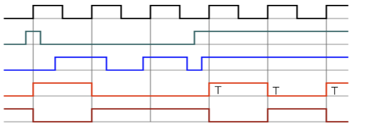
      In order for users to be able to monitor state changes of devices, and perhaps to correlate state changes of a set of interacting devices, a timing diagram would be useful. See the attached example.

      In the diagram, the x-axis represents time, and the y-axis is split into different sections, one section for each device, and inside the section there are the discrete values of the states of the device.


      To cope with state changes that are quick, the ability to switch to a “change event view” would allow the user (of a running dashboard) to detect any changes, no matter how quick they are. Such a view would treat the time intervals where the state does not change as being of equal-length, removing therefore all metric info from the time axis.

      Attachments

        Issue Links

          Structure

            Activity

              People

                g.brajnik Brajnik, Giorgio
                g.brajnik Brajnik, Giorgio
                Votes:
                0 Vote for this issue
                Watchers:
                1 Start watching this issue

                Feature Progress

                  Story Point Burn-up: (100.00%)

                  Feature Estimate: 3.0

                  IssuesStory Points
                  To Do00.0
                  In Progress   00.0
                  Complete816.0
                  Total816.0

                  Dates

                    Created:
                    Updated:
                    Resolved:

                    Structure Helper Panel